

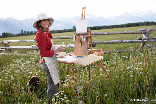
Paintings from Photos vs. Life
June 2, 2014
Some Favorite Paintings of 2014 – and why!
January 12, 2015“Color in a picture is like enthusiasm in life” -Vincent Van Gogh
Volumes can be written on the subject of color. Since it is autumn, we couldn’t resist touching on this subject for this month’s article. No doubt about it, the experience of color is a special part of life and no one does color like Mother Nature. In the summer, she exhibits the bright colors of the wildflowers. Currently, Jackson Hole is ablaze with golden aspen leaves, red mountain maple, and all is off-set by distant blue mountains and evergreens. Soon, the landscape will be blanketed in white snow with shimmering blues and greys.
As painters, we are challenged and inspired by the effects of light on all these colors found in nature. Everything has what can be referred to as a color note. A color note is the combination of hue, value (light and dark) and intensity.
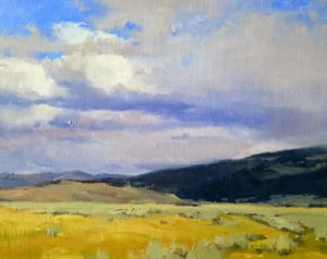
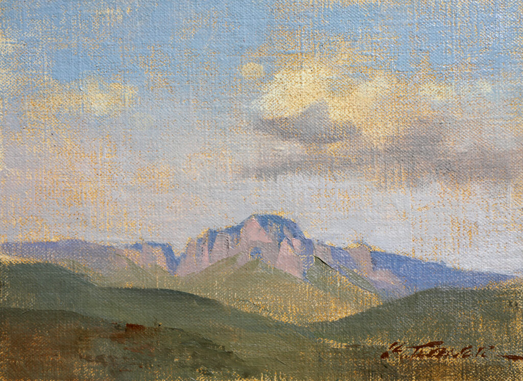
Cloud Veil by Kathryn M. Turner 16 x 20 oil on linen.
REMEMBERING ROY G. BIV
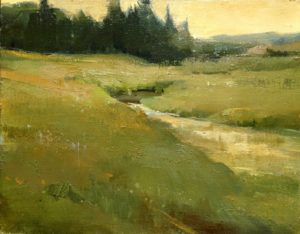
Depending on how it is being affected by light at that moment, we can identify the color note of our subject. The first thing we can ask is where the color note lies in the spectrum of the rainbow of colors. This is referred to as the hue. Remember the acronym we learned in grade school, Roy G. Biv? Red, orange, yellow…These are the color names or hues. In this painting of the Gros Ventre range, the hue of the sky is blue and the grass is yellow-green.
If there is smoke in the air, it is sunrise or sunset, the sky would likely have a different hue. Similarly, the grass is not always green. Later in the season, this same field is a honey wheat hue. Within each hue, there is a spectrum of value, intensity, and temperature.
 VALUE
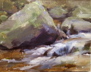
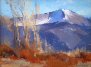
VALUEWhen creating a painting, we must also consider the relative lightness or darkness or value of an area. There is a saying in our industry- “Color gets all the credit, value does all the work.” It is the relationships of values within a painting that depicts a sense of space and form. In this painting, there is not a broad range of hues represented, but the contrast between the light and dark values describe to the viewer the shapes of the rocks and how the water streams through them.
 INTENSITY
Each color note in a painting can be bright or dull. This refers to the intensity or relative strength of saturation of any given color. As a general rule, colors in the distance appear lighter in value and less intense than when viewed close up. In nature, colors are often less intense than the colors that come out of our paint tubes. To obtain these subtle colors, we mix colors with their compliments in order to make their chroma less intense.
 TEMPERATURE
Each hue also has a relative temperature. Cool colors have a bias toward blue, green and violet. Warm colors have a bias toward red, orange or yellow. This is how it is possible to have a “cool” red such as alizarin crimson or a ‘warm blue’ such as french ultramarine.
Everything around us is an array of color. The vivid light and color of the world is what compels us to paint. As we strive to continue to understand the world of color, we do our best to create artwork that moves in a similar way.